During my second semester, my professor asked me to redesign the website for a research lab he worked at, as the existing design was outdated and didn’t meet modern standards. Along with the redesign, he also requested the following:
UX Designer
3 weeks | 10/02/2024 - 02/03/2024
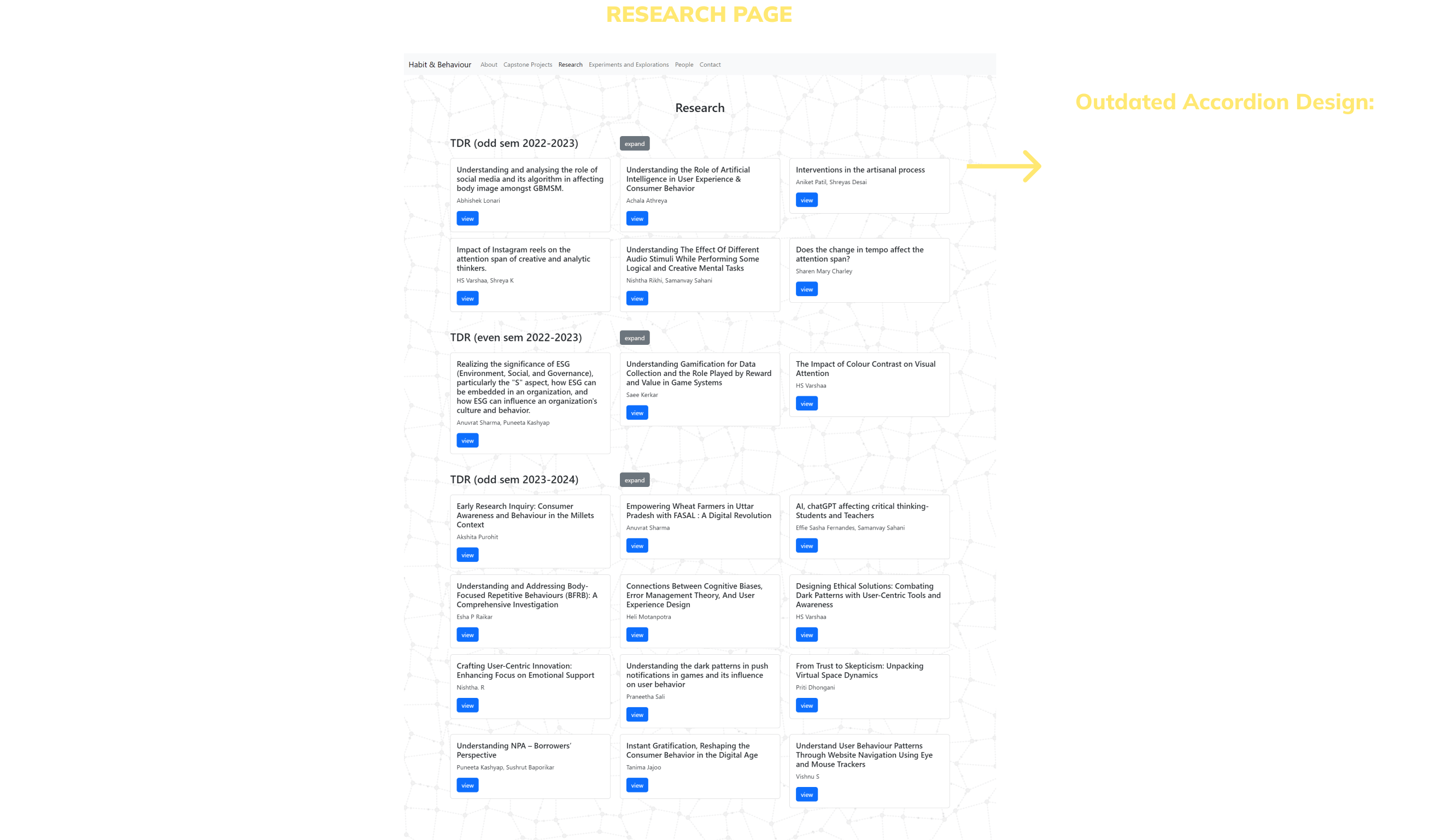
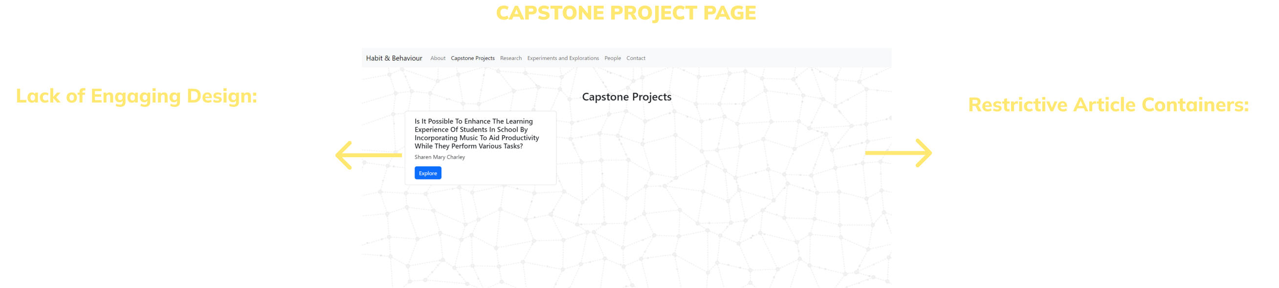
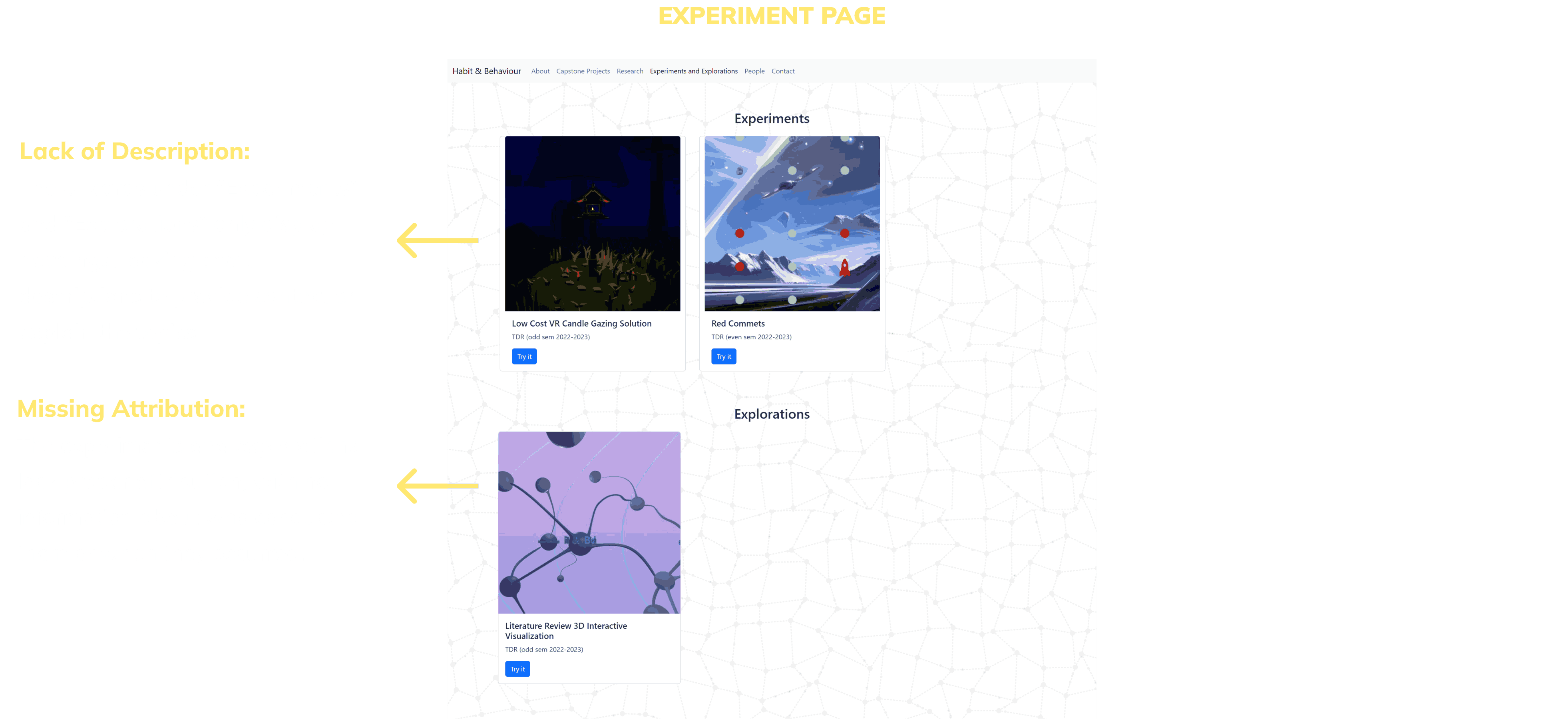
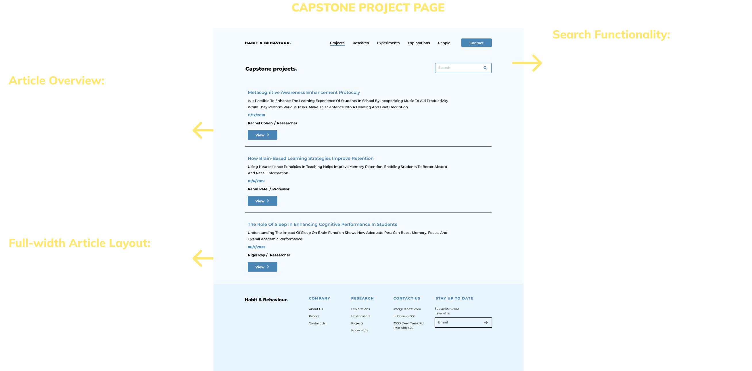
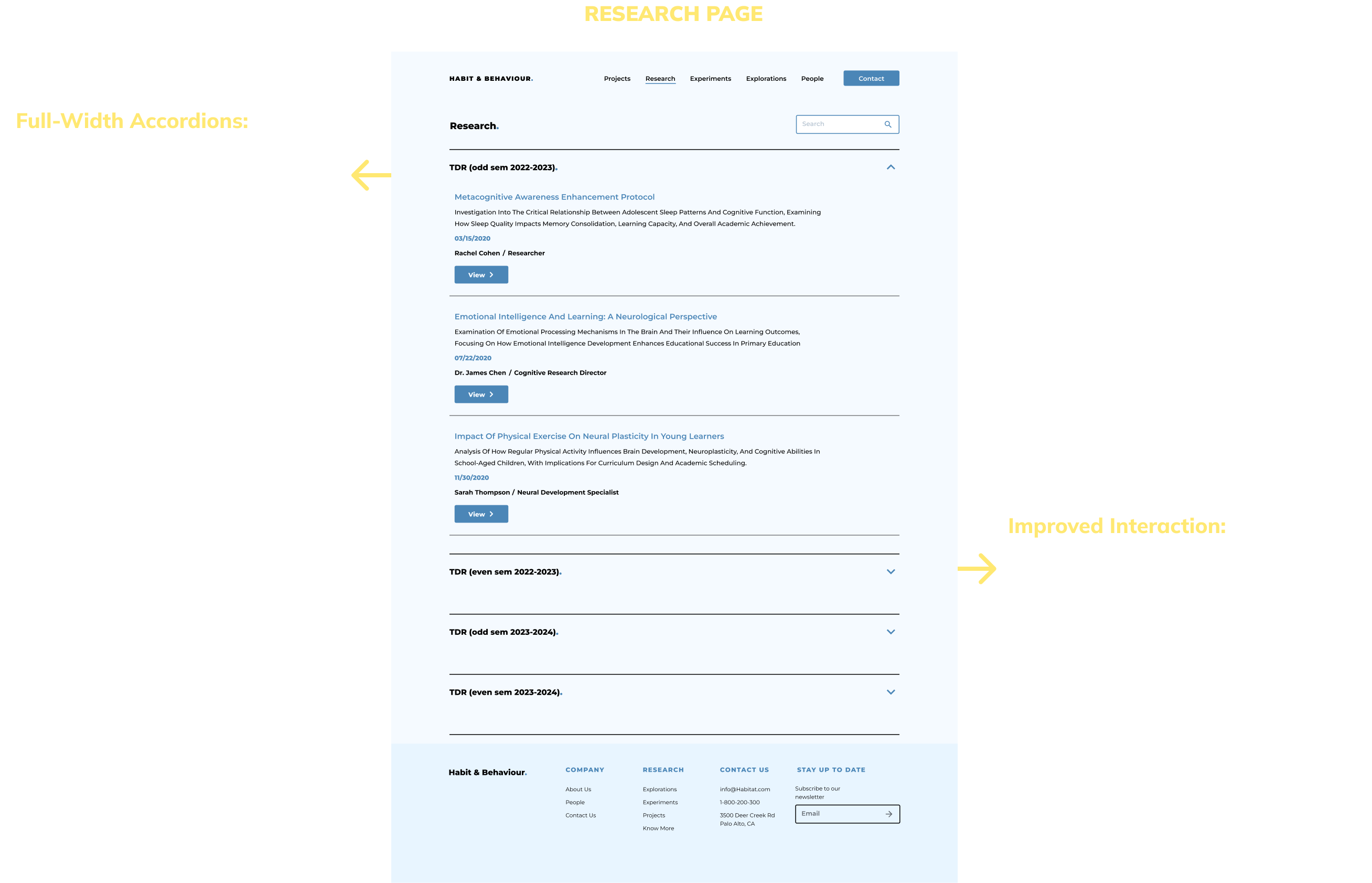
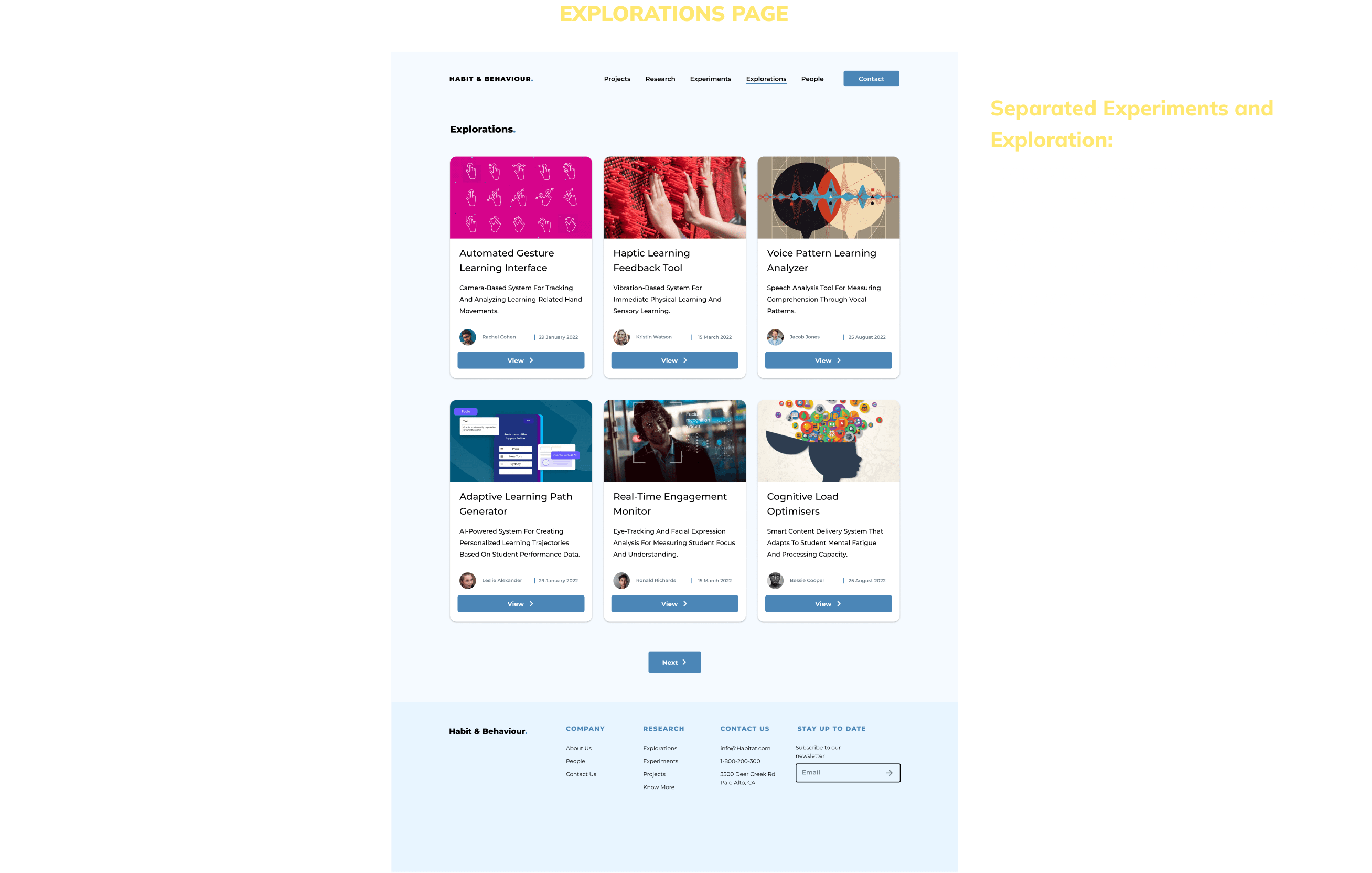
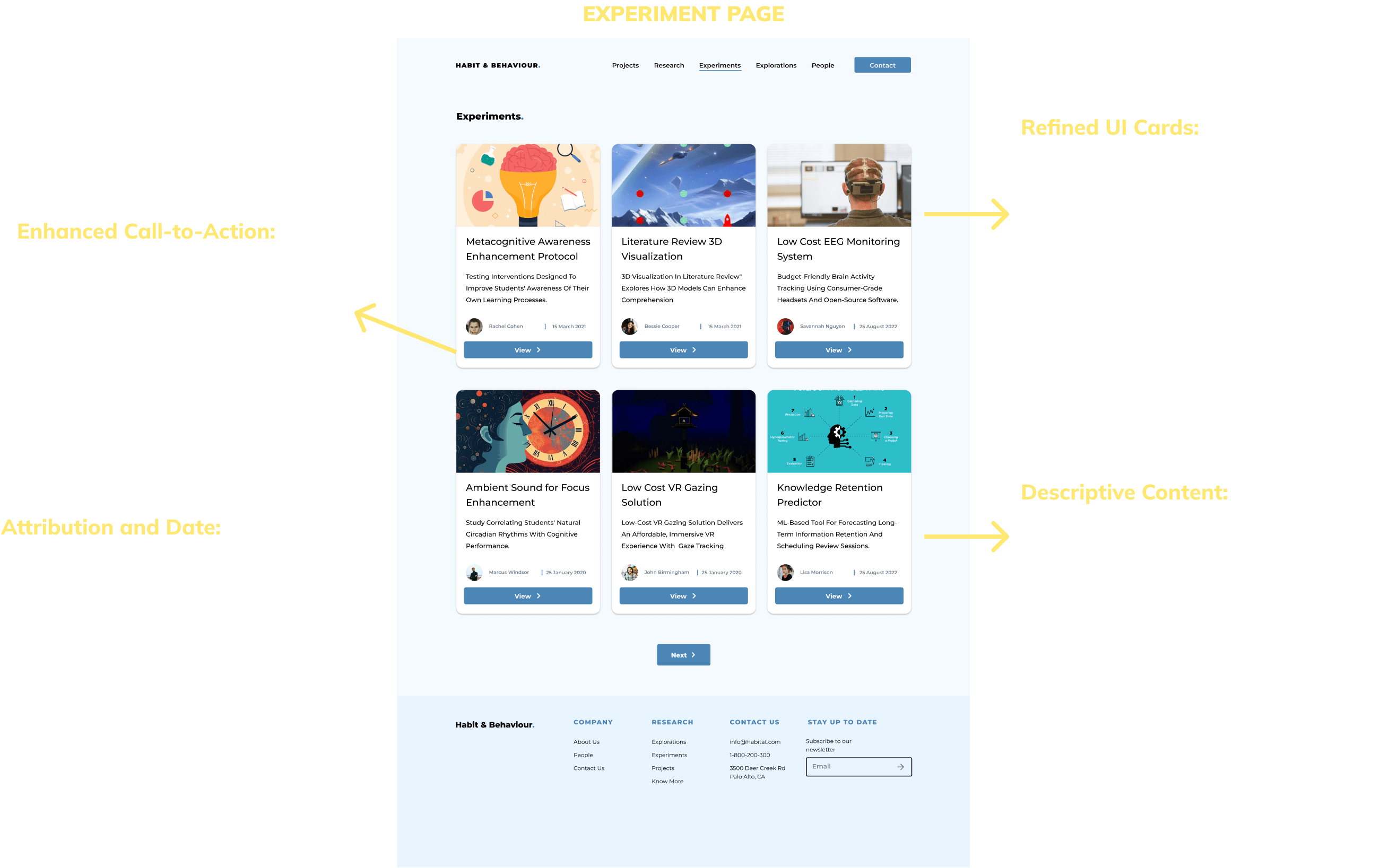
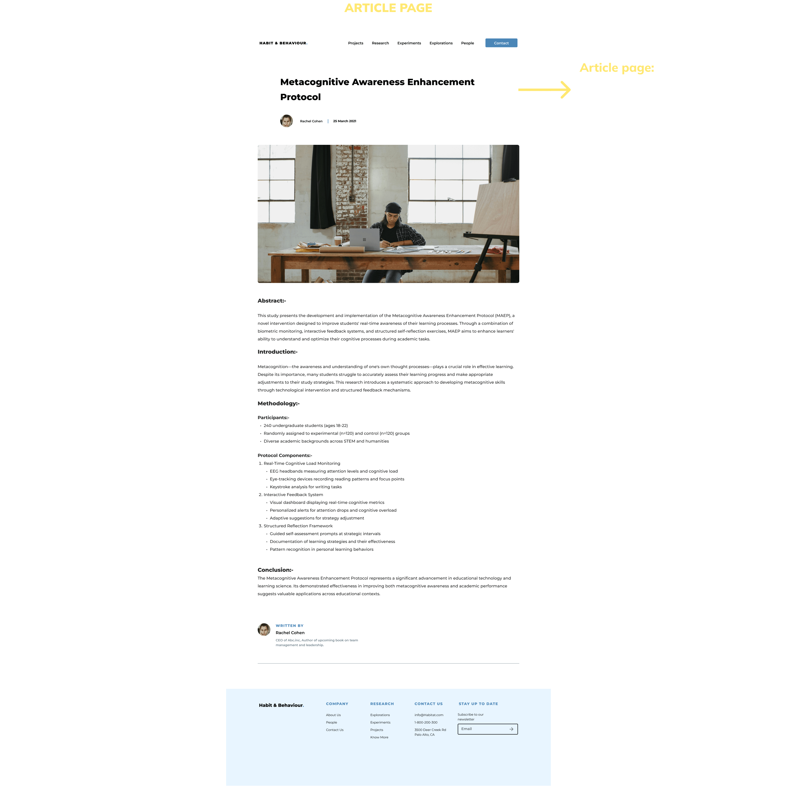
Before diving into the redesign, it is important to analyse the existing website to understand its limitations. While it served its purpose, the outdated design created challenges for both users and administrators. Here’s a look at why the current design needed improvements and how it could be enhanced to better serve the needs of its users.


Before creating this final design, I took several preparatory steps to ensure a well-thought-out approach. This included referencing other modern and relevant website designs for inspiration, creating rough sketches to explore layout ideas, and developing a comprehensive design system to establish a consistent visual language and style.


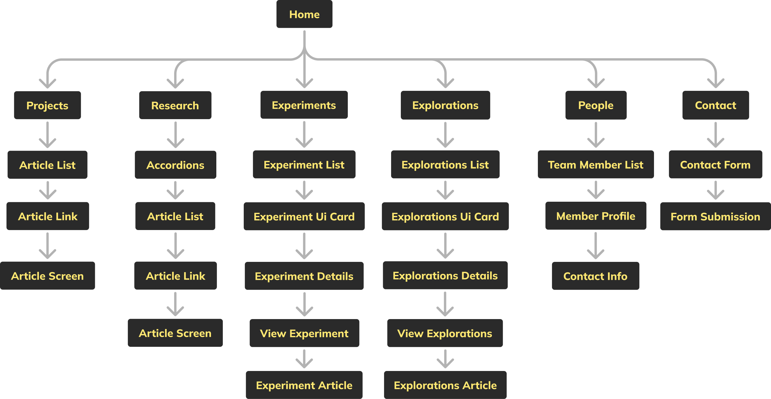
I created a site map to provide more visual clarity and help users easily navigate the website, ensuring a better understanding of the overall structure and flow.
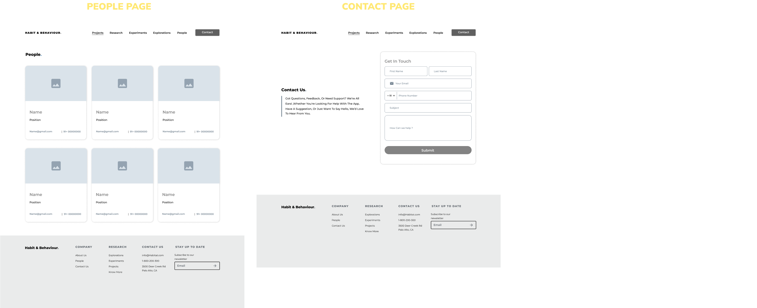
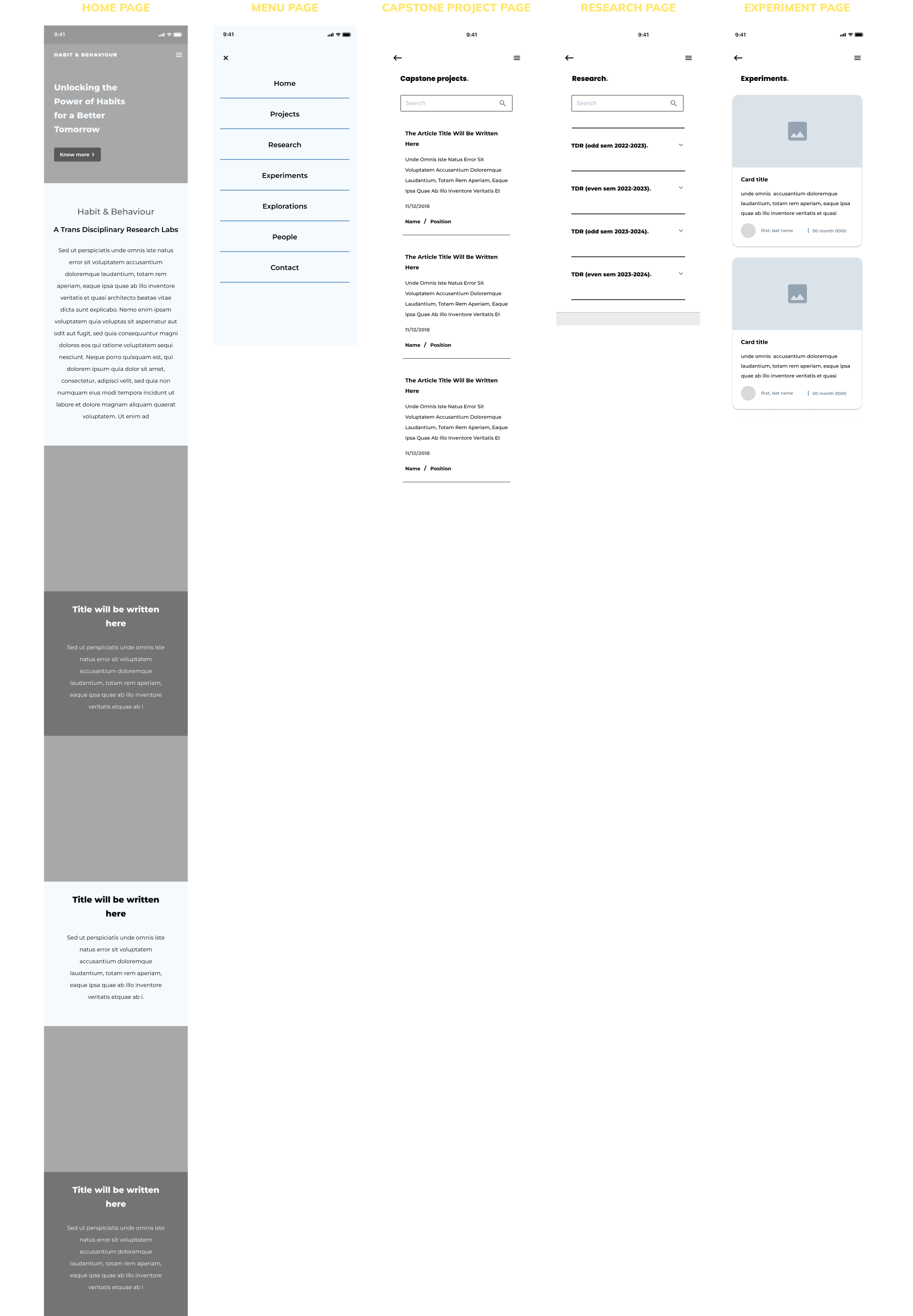
After finalizing the layout concept through sketches, I moved on to creating mid-fidelity wireframes to refine the design.


For the redesign, I built the design system around the existing color palette, making small tweaks to improve visual appeal and usability.

.png)